eCommerce Website Design Guide 2021 [+ Examples]

Truth:
eCommerce website design plays a deciding role in whether a visitor makes a purchase.
That’s why we come across great-looking ecommerce sites all the time. Businesses aren’t just doing it for aesthetics though: ecommerce web design also defines how easy it is to buy for consumers.
If you’re looking to create an exceptional ecommerce web design you know that the process has a lot of moving parts. That’s why managing online store design or redesign projects often feels like assembling a life-size Ford Mustang out of Lego bricks.
But—
As a business owner, you need just the basic ecommerce website design info to plan your store the right way. And good news: you’re about to get that info right now.
This guide includes:
What is eCommerce Website Design?
Ecommerce website design is a process of developing an ecommerce website that involves creating aesthetic elements like layout or user interface, and adding features to simplify online shopping.
The main goal of designing an ecommerce website is to create a good-looking and easy-to-use online store. This process requires effective planning, collaboration, conceptualization, and testing.
What Makes a Good eCommerce Website Design?
Research suggests five top factors that make a good ecommerce website design:
- Security & privacy
- Confirmations for transactions
- Shopping support
- Easy-to-follow checkout
- Content organization
Together, these factors give ecommerce brands the best chance to generate conversions. That’s why many ecommerce website designs focus on these five factors—many of your favorite brands included.
But what about shoppers?
They also appreciate website designs created according to this strategy. One look at customer surveys is enough to understand that the following five factors are a must.
Here’s what surveys found:
- Security: About 17% of shoppers walk away mid-purchase because they think that an ecommerce website has security issues [Baymard]
- Confirmations: Over 51% of customers treat transactional confirmations as a sign of trustworthiness [University of Oklahoma]
- Shopping support: Website design for ecommerce must include fast support options like live chat and self-help resources such as FAQs [SuperOffice]
- Checkout design: Around 18% of customers abandoned shopping carts because of a complicated ecommerce checkout design [Baymard]
- Content organization: Up to 55% of lost sales are caused by bad content issues like uninformative error messages and incomplete or unclear information [Nielsen]
So, this is how the key ecommerce web design factors influence purchase intentions and overall customer experience.
“Does it mean that I can create a great ecommerce website using this web design strategy?”
Yes, definitely it does.
This strategy worked for other ecommerce businesses, so it could surely work for yours. All we’re doing is matching shoppers’ preferences, really, which is always the right way.
With that in mind…
Here’s how to design an ecommerce website worthy of a leading brand.
How to Create a Great eCommerce Website Design
Creating an ecommerce site design means covering a range of bases. That’s why the most important design areas are divided by page: homepage, product listing, individual product, shopping cart, and checkout.
And there are also general principles—those ensuring that an ecommerce website’s design stays consistent, orderly, and “branded.” Let’s begin with them.
1. General eCommerce Website Design Tips
General tips apply to the entire shopping website design. Your ecommerce web development team will keep these in mind because they define how an ecommerce website looks, “feels,” and how easy it is to navigate.
Main menu
Website menu item descriptions should be clear, concise, and visually distinct to provide a comfortable navigation experience. A potential customer who lands on the homepage should understand how to find content like products, brand story, etc.
Main menu ecommerce design tips:
- Short menu items: One or two words per menu item description equals more clarity and fewer distractions.
- Dropdown menus: They provide more navigation opportunities for product research and help reduce the number of main menu items.
- Contrasting typography: Contrast between the menu’s font color and the background makes the main menu clearly visible on all pages.
Visuals
Images, graphics, and videos have a huge role to play in the ecommerce website design. These elements can attract attention, demonstrate products in action, inspire visitors, and showcase your brand’s visual identity.
Visuals needed for an ecommerce website design:
- UI elements. Graphics and images that help with using an ecommerce website (lines, shapes, colors, textures, etc.)
- “Hero” images. Large visuals that visitors see first when they enter an online store (also called “above the fold” images).
- Product images and videos. These need to be high-quality visuals showcasing products with realistic colors, both on a uniform background and in action.
- Brand images and videos. They contain information about the brand, its values, mission, employees, and other materials that introduce the company to visitors to create a good impression.
Accessibility options
A website design for ecommerce should be easy to use for all people regardless of their age, skills, and physical or cognitive abilities. Achieving such a design means adding some online store accessibility features.
Accessibility features include:
- Text clarity. All texts on ecommerce websites should be clear and easy to read to convey information to potential customers effectively.
- Security checks. Excessive security checks like CAPTCHA might make using an ecommerce website inaccessible for people with disabilities.
- Simple navigation. Many best online store designs follow a minimalist approach to simplify website navigation and product discovery for visitors.
- Color combinations. High-contrast color combinations for text and background help make site elements like menus and buttons stand out.
- Accessibility options button. Available on most pages on a sales website, it provides quick access to such options as contrast, text size, font change among others.
Branding elements
Your ecommerce web design should follow your brand’s visual identity. This means using the brand’s color palette, visual style, and content that reflects the brand’s personality. Together, they create an experience that ideally makes your brand more memorable.
Branding elements to add to an ecommerce web design:
- Logo. Your online store should have the brand’s logo in prominent places to provide a strong, consistent brand experience.
- Typography. Your brand uses a few fonts in marketing materials—they need to be used in designing the online store, too.
- Color palette. Brand colors should be at the core of an ecommerce website design to improve brand recognition and memorability.
- Graphic elements. They include elements like styles, patterns, apertures—your brand designers created those when you were starting your business.
Customer reviews
Over 90% of shoppers say that positive customer reviews make them more likely to use a business. That’s why it is a good idea to plan how to add reviews to create an ecommerce store design that promotes customer trust.
If you have customer reviews to showcase, consider these tips:
- Higher web page position. Adding customer reviews “above the fold” ensures that more visitors notice them.
- Extra motivation for shoppers. Consider placing a product’s rating next to its name to get exposure and potentially, more sales.
- Separate page with customer reviews. Give your ecommerce website a separate page to showcase satisfaction of the happiest customers and increase client trust towards your brand.
Shopping cart icon
This icon indicating the shopping cart serves as a reminder that a visitor added a product there. That’s why this element must be visible to guide shoppers to the checkout and score more sales.
Common shopping cart icon tips to consider before creating an ecommerce web design:
- Visibility. The cart icon should be clearly visible to remind visitors about products they might have added there.
- Feedback. Shopping cart design could have notifications and/or animations for visitor’s actions to remind them about buying.
- Icon type. The cart icon may not resemble a cart every time; clothing brands put a creative spin on this point by designing icons that look like shopping bags.
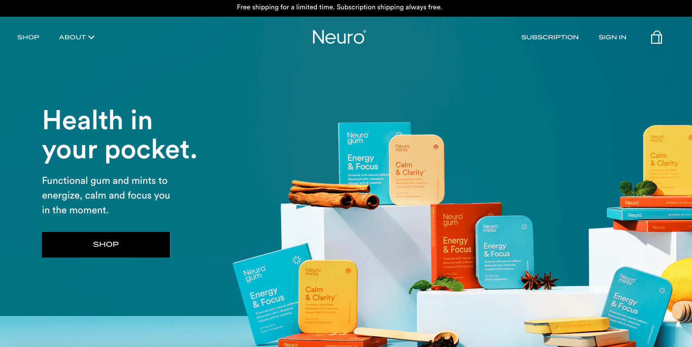
2. eCommerce Website Homepage Design Tips
The online store’s homepage is like a physical storefront of your business. These ecommerce web design tips will help create an inviting homepage, make a great first impression, and encourage browsing.
Copy
Your homepage should have a text that mentions product benefits and grabs attention. Rule of thumb: every word on the homepage should be based on the benefits for customers to convince them to browse and learn more.
Visuals
High-quality images or videos are significant to capture attention and make a nice impression. In many cases, top ecommerce website designs have product videos or images of products in action as “hero images” for a quick brand introduction.
CTA button
A prominent CTA somewhere at the center of the homepage is a great ecommerce web design technique to encourage conversions. Besides the contrasting color, this button also needs engaging text instead of generic options like “Buy now.”
Brand logo
Just like the CTA, your brand’s logo should occupy a prominent place in the ecommerce homepage design. Typically, it’s the top center, but many cool ecommerce store designs also have it either in the left or right top corners.
Main menu
High-performing ecommerce web designs have homepages with simple, easy-to-navigate, and inviting menus. They reflect the common goals of visitors: product discovery, brand discovery, blog reading, etc.
Bar with promotions
Many ecommerce websites share marketing messages with special bars on homepages. These bars are made in dark colors to distinguish them from the rest of the content. They appear on most pages to share messages with more visitors.
ECOMMERCE WEBSITE HOMEPAGE DESIGN
3. Product Listing Page Design Tips
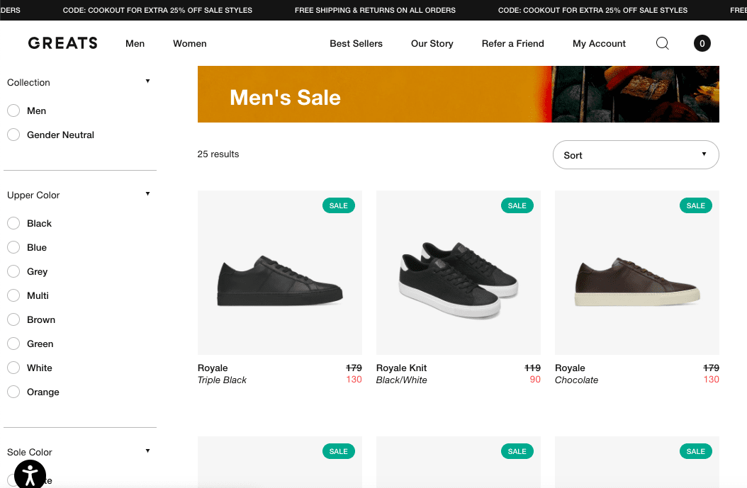
A product listing page is a page containing selection of products from the same category. It’s the next step towards checkout, whose purpose is to make product search effortless and fast.
eCommerce website designs share the following tools on their product listing pages.
Main menu
The main menu should be visible at all times on the product listing pages. This ecommerce web design technique promotes browsing by making other product categories and pages easily available without scrolling all the way up.
Product row
Consider having four items in a row on a product listing page. Adding more might undermine aesthetics of the ecommerce web design. Besides, five or more can make the images too small to see, especially on mobile devices.
Product images
If you want to give a great product overview, consider adding at least two images per item. It’s a good way to create a “hover effect” —when a visitor moves the cursor over a product image, it switches to another one.
“Add to cart” buttons
Best online store designs show multiple options to go about these. We can follow the traditional way and add them below product visuals. But many choose a more UX-friendly alternative: having buttons pop up when a customer hovers their cursor over an item’s image.
Product-related notifications
These small notifications let visitors know about sales, discounts, inventory scarcity, and other marketing campaigns you might be running. Adding them helps to introduce the sense of urgency, use product scarcity, or show countdown timers indicating how long a sale will last.
Product search option
A product listing page is where shoppers research products. So, it’s essential to give options to either start a new or refine an existing search. That’s why ecommerce store designs make search more user-centered by adding both search buttons and product customization features.
Accessibility options
Available upon clicking a special button, these include text size, brightness, cursor size, contrast, font, tooltips, and other options for visitors. This button should be visible regardless of the visitor’s position on the page.
PRODUCT LISTING PAGE DESIGN
4. Product Page Design Tips
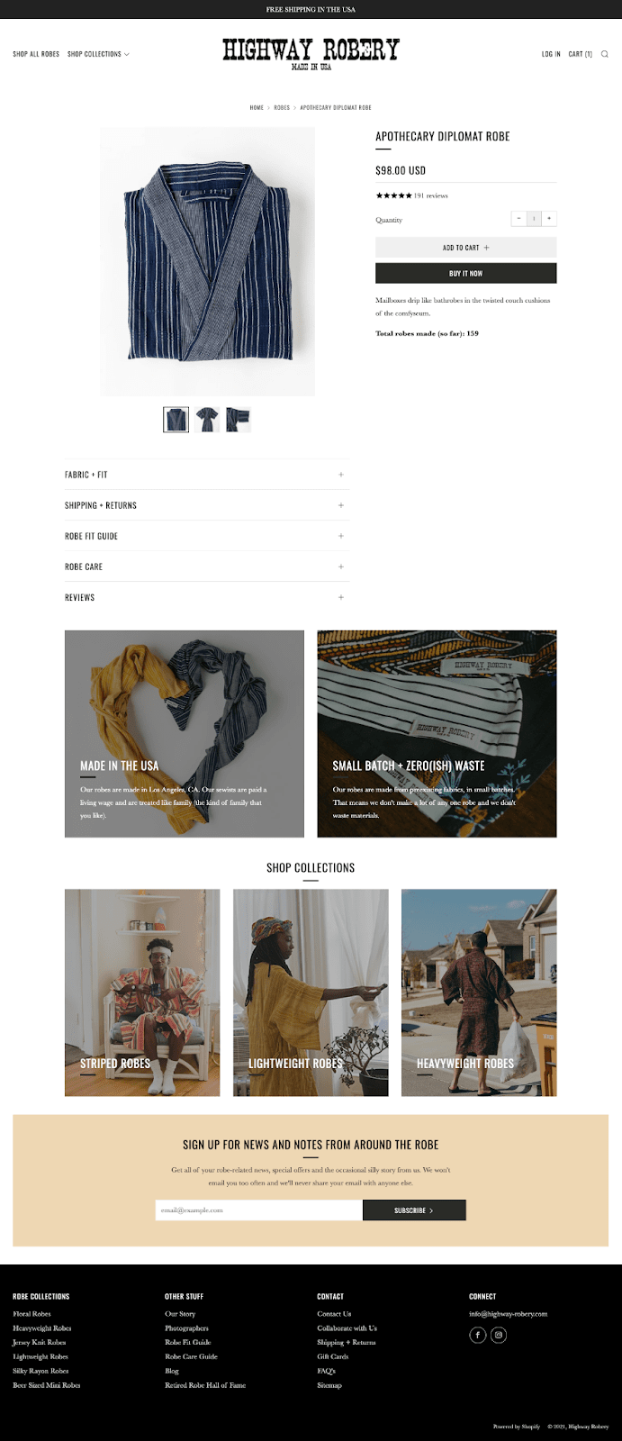
Product pages are critical in ecommerce web design. This is where customers decide to buy, so we need to make sure our UI and UX design addresses the informative, sensory, and other aspects of their experience. Do it right with the following product page design elements.
Product visuals
Product images and videos are important for 83% of online shoppers. People depend on visuals to learn more about products, so high-quality and large visuals are critical. They should showcase products on a white background—it allows them to stand out.
Product description
This section is added on the right side besides product visuals. It should give shoppers information that answers the most common consumer questions (benefits, unique features, materials used, dimensions, etc.)
Customer reviews
Consider adding a product’s star rating near its name. This will give you a good chance that customers will see it. Clicking the star rating should open customer reviews added further down the product page.
“Add to cart” buttons
The best practices for CTA buttons apply (contrasting colors, action-oriented text, prominent positions, etc.). Many eCommerce designs also include multiple buttons. Like in the below image, the customer has two choices: add the product to the cart and continue browsing, or “buy it now” and go straight to the checkout.
Shipping and returns policy
About 60% of shoppers review shipping and returns policies before making a decision to buy. Add this info in your product page web design layout somewhere in the middle. This way, you’ll make it easier to find.
Recommended/related products
Product pages often display recommended or related products. This section is useful to keep visitors browsing and researching, which increases the chance of more conversions. This makes sense, as shoppers often check dozens of items before choosing.
PRODUCT PAGE DESIGN
5. Shopping Cart Window Design Tips
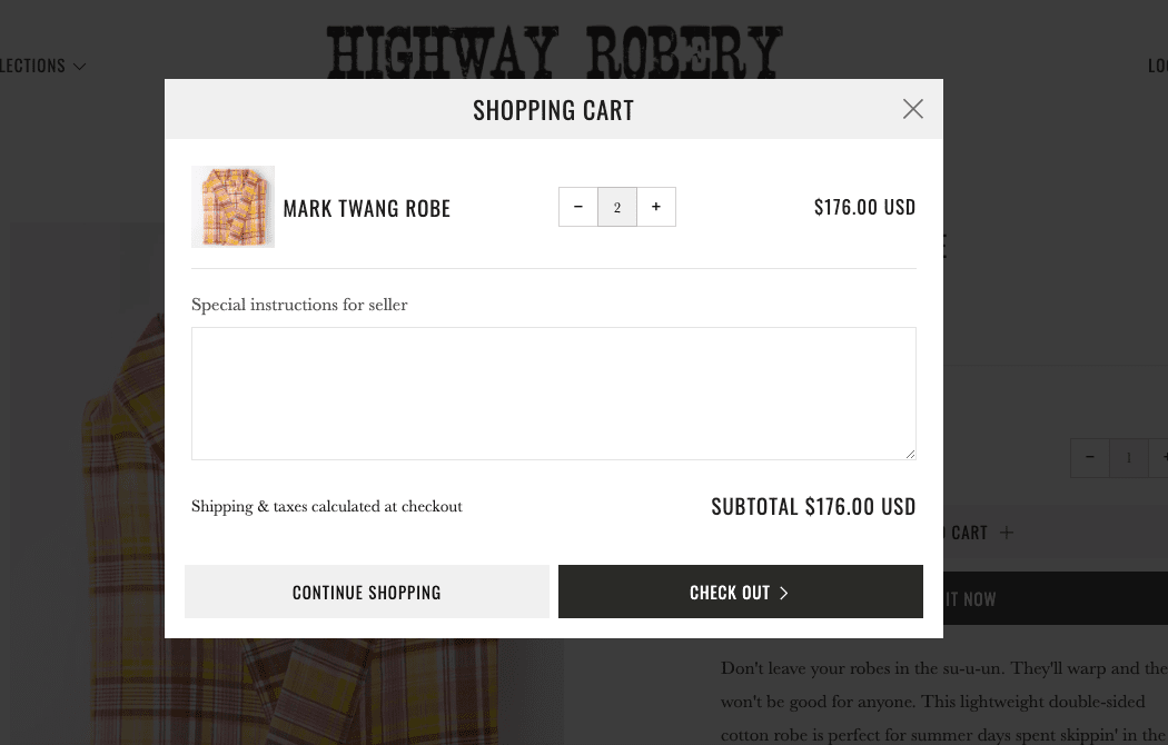
Shopping cart windows appear when customers click “Add to cart.” These important pages should assist shoppers in their buying decision—this means following the best design web practices.
Product quantity
Adding product quantity is a good idea to let shoppers add, remove, or delete items. This functionality makes product research and selection easier.
Product visual
A clear thumbnail product image should show the exact product a customer added to the shopping cart. The product title should also be present to ensure shoppers that they’re about to buy what they wanted.
Product price
Shopping cart window should display the product price (or mention that there might be other costs that are calculated later (tax, shipping, etc.). Along with product quantity and visuals, price is a part of the feedback system that builds confidence and intention to buy.
“Check out” button
This button allows shoppers to go straight to the checkout page and make a purchase. It must be integrated to draw user attention (and also located to the right in case there are more buttons).
“Continue shopping” button
Shoppers also add products to shopping carts to save them. This means that they might not be ready to buy right away. That’s why a good ecommerce website design often includes this button to allow continuing browsing easily.
Shipping and taxes notification
This notification lets shoppers know about potential extra costs associated with taxes and shipping. It could be a separate small section of just a sentence saying something like “Shipping & taxes are calculated at checkout.”
SHOPPING CART WINDOW DESIGN
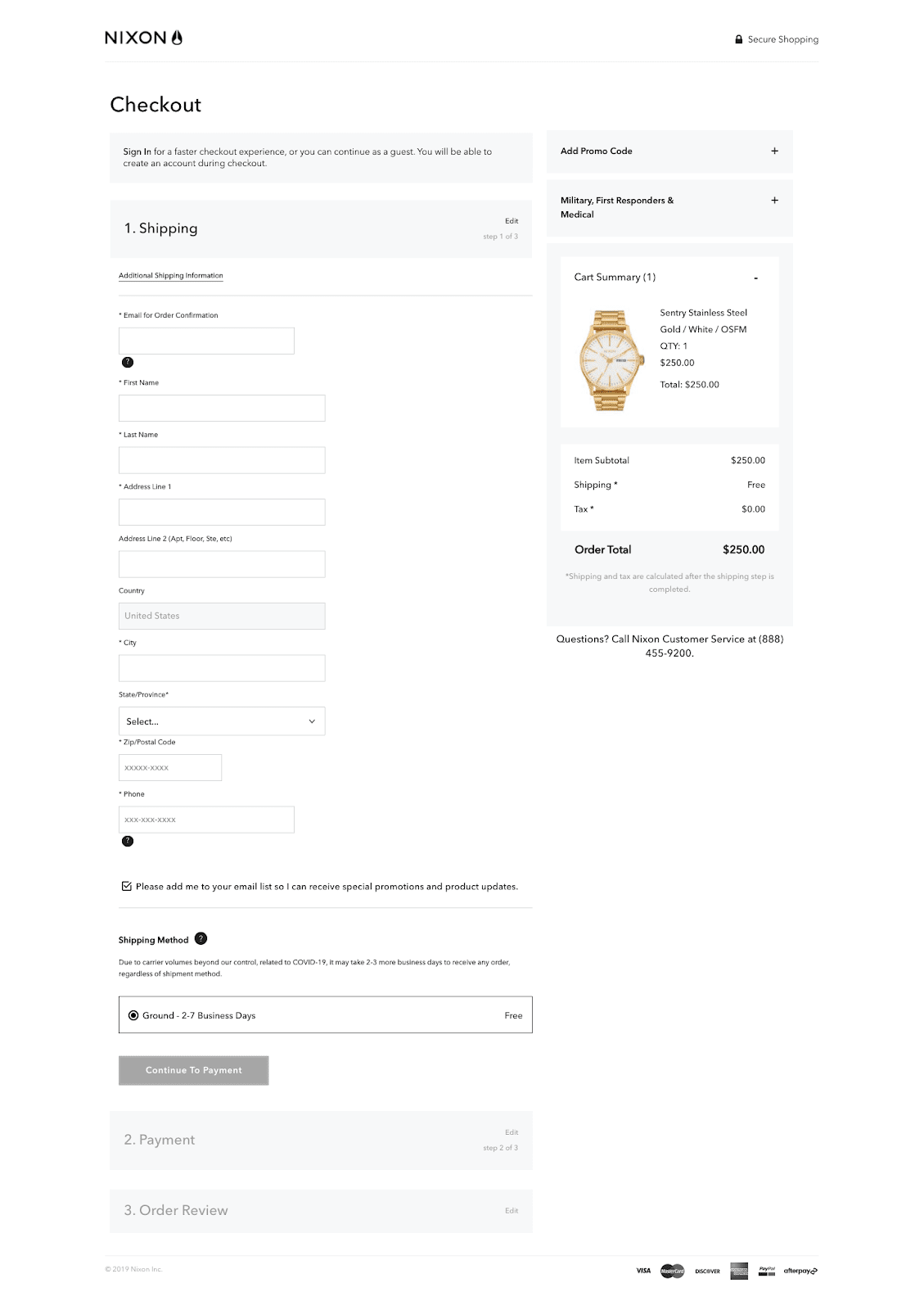
6. Checkout Page Design Tips
This is where we close the deal, so getting the checkout page design right is crucial. About 18% of customers leave shopping carts because of complicated checkouts. These ecommerce web design elements will help keep your ecommerce website design simple.
Contact information
This section involves a customer’s name and contact details. Popular two-column checkout page layouts have this section on the left (see the image below).
Shipping & delivery
Located right below contact info, this section requires customers to enter their address details needed to deliver the order.
Trust signals
Trust signals (company logos, social proof, etc.) should be prominently displayed to increase customer trust. Consider adding them in a proper place to reduce doubts and encourage buying.
Payment options
Add multiple payment options to get as many orders as possible. Different customers have different preferences, so having at least several options is recommended.
Field for a discount code
This is where customers apply discounts they found elsewhere. Adding this element near the price is a logical choice.
Guest checkout
Registering as a customer is a major turn-off for many buyers, so add an option to check out as a guest. This means having to provide only the essential info needed for product delivery.
CHECKOUT PAGE DESIGN
Best eCommerce Website Design Examples
These beautiful ecommerce website design examples check all the boxes in terms of security, support, checkout, confirmations, and content organization. Here’s how successful brands used this five-point strategy to build beautiful and easy-to-use ecommerce designs.
Asphalte
Asphalte’s ecommerce website design feels elegant and classy due to a full-screen photo and typography. This professional ecommerce website design uses a contrasting CTA to draw attention and encourages browsing with easily accessible navigation and on-site notifications.
Tieks is channeling positive energy through the ecommerce website design. Bright light colors, simple navigation, and quality product photography contribute to the unique and inviting brand experience.
Tieks is a great example of a successful ecommerce website redesign. The brand revamped its online store to engage more visitors and improve the website experience.
Check out the details of this project: Tieks Case Study.
POGG
POGG is one of the ecommerce website designs that “scream” uniqueness and fun. Unusual website menu location, animated homepage visuals, and cool typography convey the brand’s personality and encourage exploration.
Pilgrim
Undoubtedly, this is one of the top ecommerce website designs that center on customers. The brand describes the benefits of its products with any possible tools such as texts, visuals, menu, and the overall layout. It’s a great decision for brands selling health and personal care products.
Chubbies
This eCommerce website design reflects a positive and quirky brand personality, which is a great customer engagement technique. Chubbies is another amazing example of how good ecommerce sites can play a significant role in the overall business strategy.
eCommerce Website Design: Summary
That’s it. Chances are that you now know more about ecommerce web designs than most of your competitors do. Great job!
eCommerce website design can make a difference for your online store. For customers, design is an important factor that defines their experience with your business, so following the best design practices is a must to succeed in your domain.
We hope that this guide has helped you get a better idea of how to design an ecommerce website. Combine this info with your knowledge of your target customers and professional web design expertise, and you should create a high-converting site worth any list of the top ecommerce website designs.
Learn more about our web design services and contact our team for a consultation, or full-scale assistance.